
Fonts are elements that are widely used in the design. By choosing readable and aesthetic fonts, you will be able to set the mood for your website, mobile app, or presentation and convey the brand’s corporate identity.
Designers must understand the nuances of different typography and have a creative eye to use fonts to their full potential. If you’re looking to be a professional UX/UI designer, knowing the varying families and styles of typography and what each is best suited for is a core skill you should work on.
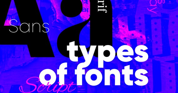
Types of fonts
When selecting a style it’s not entirely correct to talk about a particular font. In choosing a font for a client’s website, professional UX design studios consider several concepts.
- Headset – This is a font family. They may differ, but they always have a unified style and convey similar emotions. A headset includes, for example, the Arial family.
- Font style – This is the specific style within a headset or family, such as Comic Sans.
- Typeface – This term refers to the orientation of the letters, including their slope (e.g., italic), width (e.g., condensed), weight (e.g., bold), and size.
- Font types – Encompassing several headsets, font types are large groups with an overarching theme, such as serif or sans serif.
For more information about the basic terms of typography, you can read Canva’s official website.
click here – 5 Stages in the Design Thinking Process
Font Classification
There are three major classes or types of fonts, which each have their uses and subcategories.
Serif
Like Times New Roman, Serif fonts have additional lines projecting from the main strokes of the letters. These fonts are usually seen as more formal and are commonly used in academic and professional settings.
Serif fonts can be divided into four main categories or subspecies:
- Old – A classic serif style, these fonts dated back to the Renaissance and were originally developed to simulate handwriting. For example, Garamond is an old serif font. These fonts are suitable for setting a historical tone, such as for a museum website.
- Transitional – Transitional fonts date back to the beginning of the 18th century and take a more modern approach to serifs than the old style with a more simple and understated design. For example, Georgia is a transitional serif font. These fonts are often used in official documents, such as letters and academic papers.
- New – Created in the late 18th century, new serif fonts, also known as modern serif fonts or Didone serif fonts, have a stark contrast with a mix of thick and thin lines. These fonts stand straight, lacking the usual serif slope, which creates a more formal appearance. Similar to transitional fonts, they are customarily used in official capacities.
- Promotional – A newer serif font, promotional serif, or slab serif, began being used in the 19th century. As the name suggests, the original intent of this font subspecies was for it to be used in promotional materials and advertising. These fonts are characterized by their squared, antique look.
click here – Top Strategies for Enhancing Your Brand
Sans Serif Fonts
As the name suggests, sans serif fonts are characterized by their lack of serifs or the absence of the additional lines protruding from the main strokes of the letters. These fonts are more straight, simple, and minimalist and are often used in a more casual context. These fonts are often regarded as more legible and straightforward than serif fonts without extra embellishment.
Similarly to serif fonts, sans serif fonts can be broken down into four subcategories:
- Old – Old or grotesque sans serif fonts are the oldest fonts and are most similar to serif fonts.
- New – These have minimal contrast, the exact width of letters, reserved style. This makes them versatile in their use. The most popular font, Helvetica, was created by designers from the Swiss typography school.
- Humanistic – They have higher contrast and smooth transition lines. Such fonts are easy to read, although they are smaller compared to other ones.
- Geometric – These are created based on circles, squares, and triangles. They are easy to read and have precise shapes often used in company headings (e.g., Volkswagen), signboards, posters, and other large-sized inscriptions.
Decorative
Decorative fonts include options for games, comics, or unusual options for logos and heading design. In addition, they can imitate handwritten writing or Gothic fonts.
There are many decorative fonts out there to choose from, or you can also create your customized font that fits the specific needs and tone of your project. Companies would often begin their font for branding purposes in the past. Some still do, but the trend towards minimalist design has made it a less popular choice.
That being said, decorative fonts still have their time and place and can add a lot of character to a brand or product. For example, a quirky mobile game may benefit from a fun and decorative font compared to a classic minimalist one. A creative piece may benefit from a fun and artistic take on text in the form of a subtitle to break things up.
In Conclusion
Fonts are not just a vessel for conveying content; they set a mood and tone for the brand and can be a powerful tool for engaging users and creating an impact. What the words say may be necessary, but we must also consider that the style of the letters themselves is speaking to readers. Knowing what types of fonts are suitable for what occasions is the first step in understanding typography’s powers. Sound designers can use this to their advantage with a bit of research and creativity.
To Know Some Great Stuff Do Visit CaresGuru
To Know Some Great Stuff Do Visit CrazzyCricket
To Know Some Great Stuff Do Visit CricFor